
Focused positioning
The first screen establishes Miktam as a private Christian journal for iPhone and immediately explains the purpose of the product.
Rambler Product Website
A public website for a private Christian journaling app developed and operated by Rambler Group.
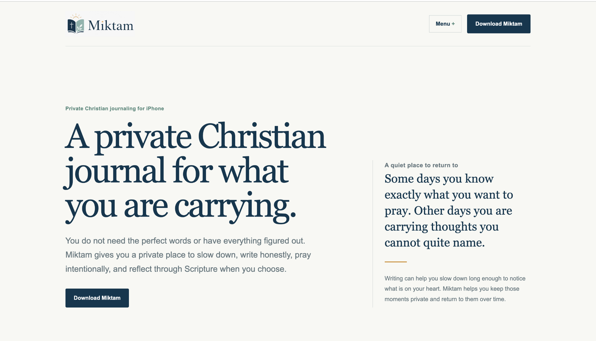
Miktam is built around private journaling, prayer, Scripture, and reflection. The website needed to introduce that experience without turning a quiet product into a loud marketing page.
The homepage leads with a simple product promise, explains what the app is for, and keeps the main action direct: download Miktam.
Because Rambler develops both the product and the website, the public site can evolve alongside the app instead of becoming a disconnected marketing layer.
The website is intentionally restrained so the product message stays clear and the visual experience matches the kind of app Miktam is.
The first screen establishes Miktam as a private Christian journal for iPhone and immediately explains the purpose of the product.
Typography, spacing, color, and restrained interaction create a calmer presentation that fits the journaling experience.
Download actions stay easy to find without competing with the product story or overwhelming the page with calls to action.
The site keeps the same hierarchy and tone across desktop and mobile, where many App Store visitors will arrive.
The finished site gives the app a recognizable identity outside the App Store, communicates the product in a few clear ideas, and gives interested visitors an obvious path into Miktam.
Tell Rambler what the product does, who it is for, and what you want people to do when they arrive.
Start a project ↗